Community
My Role: Ux Designer
Duration: July 2022 - August 2022
Responsibilities: End to end designer
Project Overview
The Product: Community is an app and website designed to help young adults involved in community service through discovery on an easy-to-use interface.
The Problem: Young adults struggle to find and sign up for community service events in their local area. The community app has identified a barrier to finding community service events, which is largely due to the lack of intuitive ways for young adults to discover these events.
The Goal: To create a website and application that makes it easier to find and sign up for community service events.
Understanding the User
Starting with user research, I created personas around the design prompt: Create a community service application for young adults, designing both an application and a Progressive Web App. I started with a hypothesis that many young adults aren’t participating in community service due to a lack of knowledge about community service, as well as a lack of resources that help them find community service events. After creating personas, I researched other companies that list community service events to do a competitive audit. From there, I created a user journey map and ideated on designs. In my research, I found that many websites are better at finding events, but not community service events.
User Pain Points
Discovery - Young adults often struggle to find community service events in their local area.
Accessibility - Young adults don’t always have the latest technology; therefore, they need multiple ways to search for events.
Services- There are resources for hosts of events, but fewer resources for volunteers.
Persona 1: Ralph
Ralph is a college student who needs an application to help them find nearby community service events because they want a quick way to find nearby events on their phone.
Persona 2: Jessica
Jessica is a working college student who needs a responsive website to find local community service events because they want to give back to the community, but cannot download an application.

Competitive Audit
An audit of competing products provided direction on opportunities that could be addressed with the Community app.
Starting the Design

Paper Wireframes
I began the Ideation process with Crazy 8’s, then moved on to creating paper wireframes to create the ideal framework for the application. Focusing on a simple layout for users to get them signed up for events more quickly.
Digital Wireframes
I wanted to make it as easy as possible to refine a search for users. Initial feedback was that these refinement options should be added to the home screen.
Low-Fidelity Prototype
To prepare for testing, I created a low-fidelity prototype that connected the user flow for discovering and signing up for events. Linked here: Low-Fidelity Prototype
Usability Study
I conducted two rounds of usability studies. The findings helped me identify the pain points users had with the initial low-fi prototype. This informed my design for the mockups.
Study Type: Moderated Usability Study
Location: Remote
Participants: 5 Participants
Length: 15-20 Minutes
Findings
1) Users asked for a map to see where events are taking place around them
2) The language used in the application for buttons and other elements was confusing to some users
3) Users found the “search” button on the home page confusing.
Refining the Design
Mockups:
Users were initially confused by the search button and wanted more refinement options. I created a clearer refinement option
Mockups (continued):
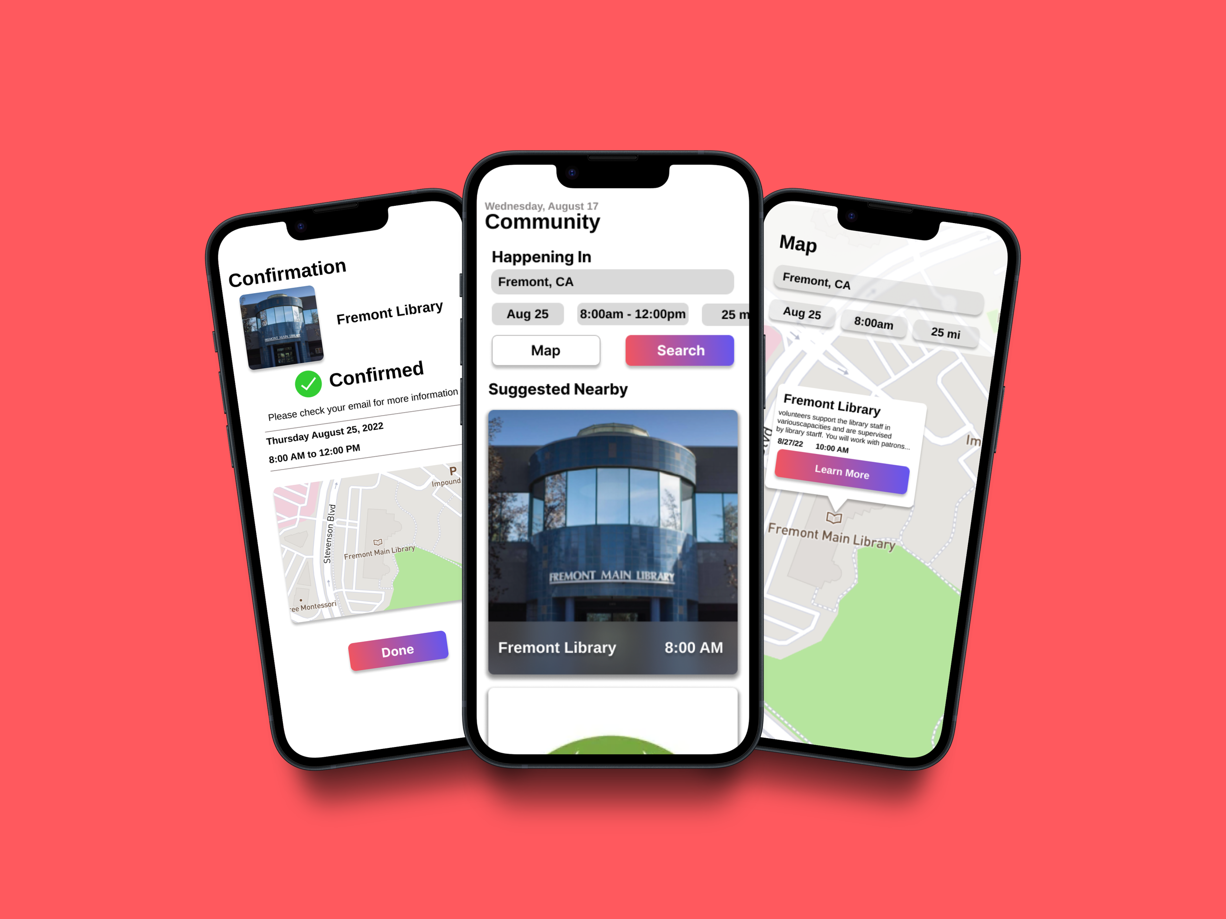
I created a visual way for users to explore events with a map. I got feedback that users wanted to refine their search in the map as well. I added search refinement for easier discovery.


The Final Desing
Accessibility Considerations:
1) Clear labels for interactive elements that can be read by screen readers.
2) The home screen focuses on personalized recommendations help users find events nearby.
Responsive Design
Sitemap
I wanted to create four areas where users could easily find related information. Emphasis was placed on the transfer experience.

Responsive Website
I wanted to create a responsive website that would look just as good and be just as simple as the application on a couple of different screen sizes
Going Forward
Impact: When shown the final mock-up, my friends and family, whom I asked to do usability studies, were super excited to see how far I had come in the course. They said, “If this were a real website/application, I would love to use it”.
What I learned: During this project, I brought together everything I had learned during the course to design a product that even surpassed my goals. I will apply these skills to my work in the future. I was able to create a well-thought-out design.
Next Steps: I will present this to the key stakeholders of this project, then finalize all elements of the design and prepare the project for handoff to the engineering team. Finally, after the product is launched, I will view data on usage and feedback from users to iterate, tweak, or even design new portions of the app. Adding new features and designs.