Keep Oakland Beautiful Website Update
Overview
Role: UX Designer
Duration: 3 months
Responsibilities: Build out and apply design principles to a new website using Squarespace
About: Keep Oakland Beautiful is a non-profit in Oakland, California whose main focus is the beautification and upkeep of Oakland. They are volunteer lead and rely on donations for their operations. Their current website host and donation management service was shutting down and they needed to create a new website. My main responsibilities for this project was to help find a new website host and build out a new website.
Starting the Design
The design process started with a site audit. Specifically looking at elements, function and layout, then highlighting what could be updated. By taking screenshots, I collected a number examples on the site that I thought could be improved and placed those recommendations into Figjam. I presented my findings in a meeting with the KOB team for them to review.
Site Audit
Next, I collected a number of example screenshots of other non-profit sites. These were presented in the meeting as well for KOB members to review. They let me know that they wanted a site that was informative and inviting with the goal of increasing donations and increasing involvement from the community.
Finding Inspiration
Before I started to work in Squarespace, I made low-fi wireframes to present t at weekly design reviews with KOB. These wireframes also help the client visualize what I had in mind each week. One issue I ran into was not being able to replicate exactly what I had intended due to the constraints of the Squarespace editor.
Rapid Prototyping of the New Website
The Website Before
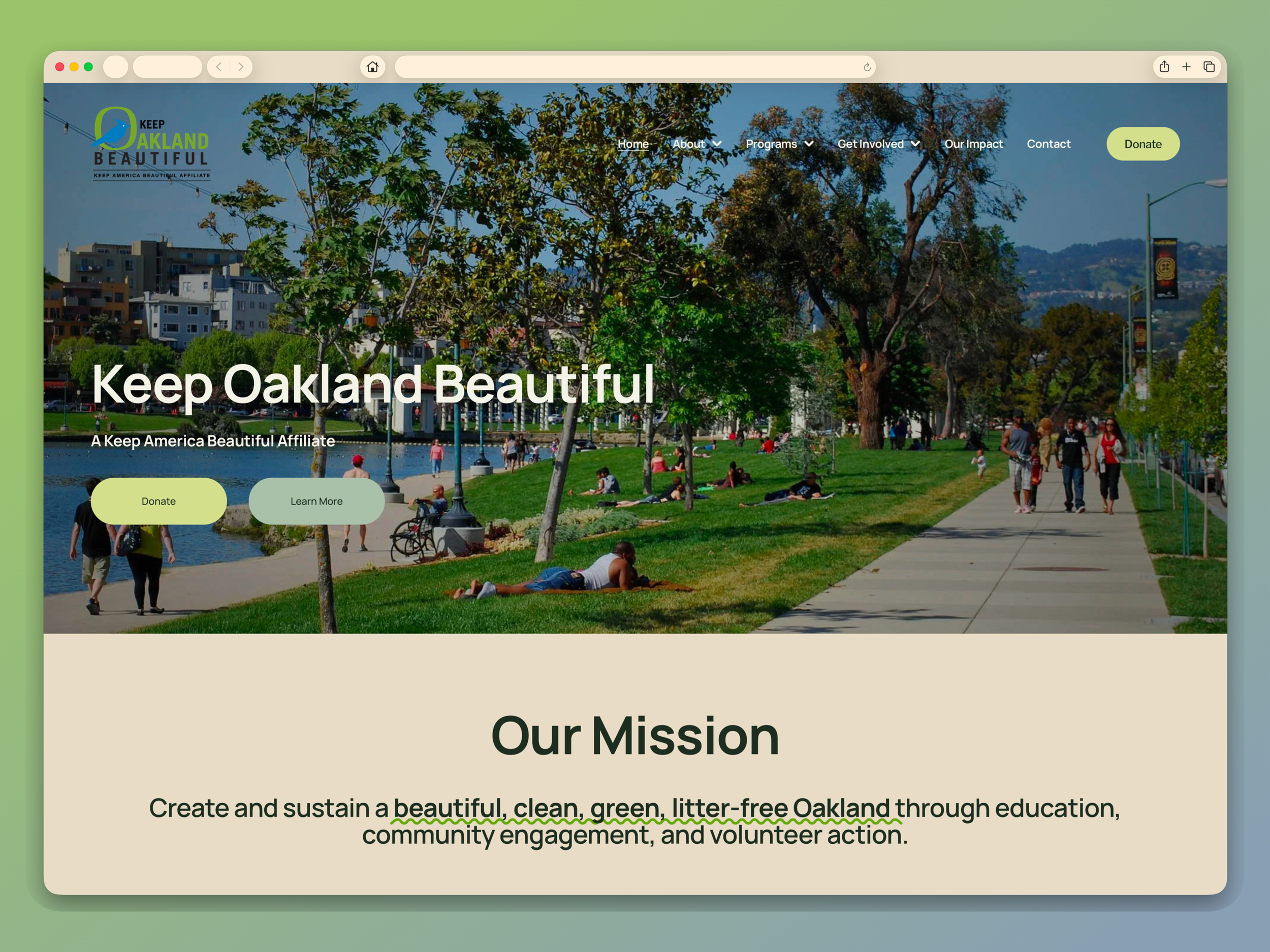
The Final Design
Building and Launching
Using Squarespace to build out the website, I transferred all copy and assets to the new website. For every page, I created a wireframe as loose guidelines for myself and would make changes, especially with the contrasts of the Squarespace editor. Each week I would meet with KOB to go over progress and design updates. Emphasis of the new site centered around easier ways to donate and to quickly find information about how to get involved. In the final weeks I worked with KOB to figure out animations for the site, color pallet for the site and a typeface that felt friendly and welcoming. I handed off the website to KOB in early May and they launched it one week later.