Bank of the Bay
My Role
Ux designer - designing Bank of the Bay from conception to delivery
Duration
June 2022 - July 2022
Responsibilities
User Research
Paper and Digital Wireframes
Low Fidelity and High Fidelity Prototypes
Conducting Usability studies
Iterating on designs
Tools
Pen
Paper
Adobe XD
Google Workspace
Coursera
The Product
This is a responsive website designed to make it easier to transfer money between account and send money to family and friends
The Problem
Many people use a separate website for banking and sending money. While on the go, switching websites to check account info then to send money can be a hassle.
The Goal
Create a seamless experience for users who have to transfer money as well as send money to family. Make banking as easy as checking email
Project Overview
Understanding the User
I took time to interview two individuals about their needs for a website where user could transfer and send money. I assumed that most banking websites were not the best for both actions users are looking for. In my research I did find that users often would transfer money and send money with different application. I realized that a users wanted banking application to more prominently feature these features on their websites.
User Pain Points
Time - Users don’t want to wait for money to arrive in their bank account
Accessibility - Users don’t want to go hunting for the correct link on their banking or payment sharing websites
Simplicity - Users want one website that has banking and payment sharing in one place
Persona 1: Angelica
Angelica is a Business Analyst supporting their family financially who needs a simple way to transfer and send money because they currently use multiple applications to complete their tasks.
User Journey
Mapping Angelica’s user journey revealed how useful a responsive website for money sending and transfer would be.
Starting the Design
Paper Wireframes
After completing crazy 8’s, I drew multiple wireframes of ideas I had for the responsive website. As I ideated on the design I would keep elements that I most liked from one wireframe to the next till I created my final paper wireframe.
Digital Wireframes
In the first wireframe I took the input what users wanted and needed and created a simple wireframe that focused on transferring and sending money quickly. I changed from my initial wireframe.
Low-Fidelity Prototype
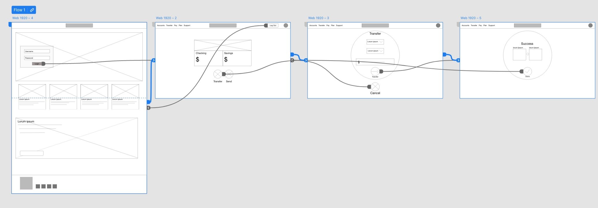
I created low-fidelity prototype created from the set of digital wireframes fro the responsive website. This image shows the initial screens used for user testing.
Linked here: Low-Fidelity Prototype
Usability Study
I conducted two rounds of usability studies. The findings helped me to discover the pain points users had with the initial low-fi prototype. This helped to inform my design for the mockups.
Study Type:
Moderated Usability Study
Location:
Remote, SF Bay Area
Length
15-20 Minutes
Participants
5 Participants
Findings
Confirmation - Users found the confirmation screen did not confirm the action enough
Loading - Users did not know if the page had fully loaded.
Prototype issues - Users asked why the prototype didn’t fully function yet.
Refining the Design
Mockups:
After the usability study I did find that users found the layout to be easy to use. I was unsure about the design direction so I chose to do a frosted glass look.
Mockups:
The transfer screen was updated to have clearer action buttons and reduced the amount of information at the top of the screen and continued with the frosted glass look.
Accessibility Considerations:
Buttons - Large buttons with contrasting font colors
Font - Bold font for headers, medium fonts for subheadings
Responsive Design
Sitemap
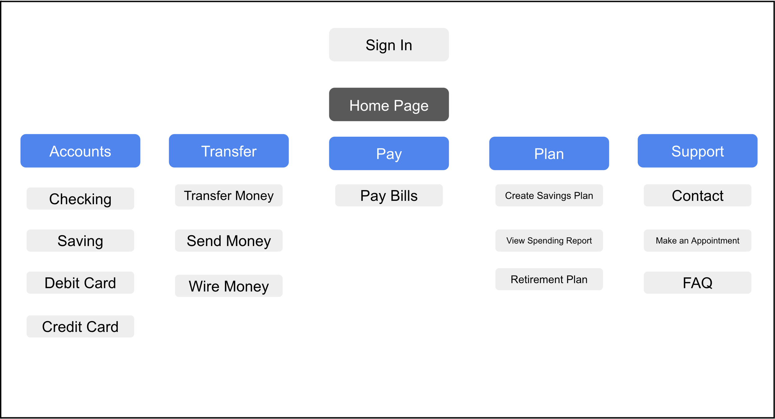
I wanted to create four areas which users could easily find related information. Emphasis was placed on the transfer experience.
Responsive Designs
This was my first time adapting a design from desktop to mobile. I wanted to create a similar experience for the user across devices. I wanted to keep the frosted glass look.
Going Forward
Impact:
The impact of the designs made it much easier for participants in the end to send and transfer money. Since this product has not launched data such as downloads and sign-ups cannot be measured.
What I learned:
This was my first time working with web layouts and it took me more time to understand it than designing for mobile. I feel that next time I should work my way up from mobile to desktop..
Next Steps
Finalize all elements of the design and prepare the project for hand off to the engineering team. Finally, after the product is launched I will Monitor metrics like downloads and usage data and review feedback. Iterate design elements as needed.


